Theme Options
Below are some of the options available for this theme.
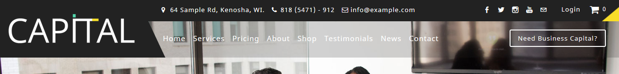
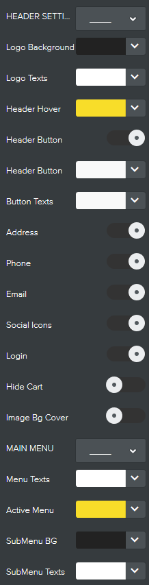
Header Settings
Logo Background & Logo Texts
Sets the background color of the logo area and the top header (the black bar at the top). The logo texts sets the text color of the logo (if you're using website title instead) and the texts color of the top header options (address, phone, email, social icons, etc.). Header Hover: Sets the color of header texts on mouse hover. Header Button & Header Texts: Hides/show the button on the right of navigation menu (Need Business Capital?) and also on mobile menu. The "Header button" color sets the background color of the header button and the "Button Texts" text color of the button. Address, Phone, Email, Social Icons, Login, Cart: Hide/show above listed when turned on/off. Image Cover: Puts a transparent layer over header background image so that texts are more visible. Removes the transparent layer when turned off. Main Menu
Menu Texts & Active Menu:
Sets the text color of the menu items. The active menu sets the text color of current menu and their hovered state. SubMenu Bg & SubMenu Texts: Sets the background color of the sub-menu bar and sets the text color of the sub-menu items. |
|
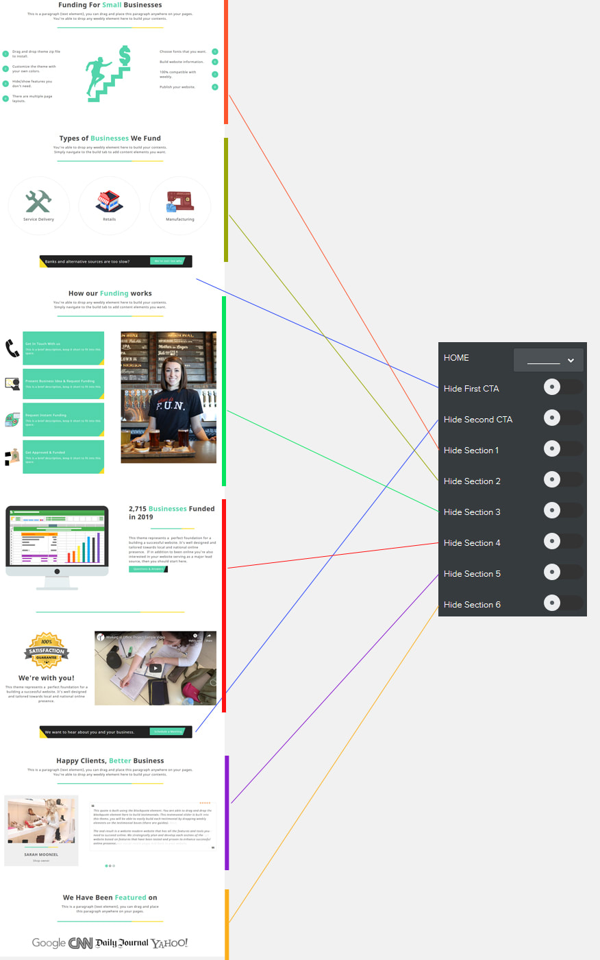
Home Options
Hide Section 1, 2, 3, 4, 5 and 6:
Removes above listed custom content sections within the homepage
Hide First CTA & Second CTA:
Removes the two call-to-action centers on the homepage.
Removes above listed custom content sections within the homepage
Hide First CTA & Second CTA:
Removes the two call-to-action centers on the homepage.
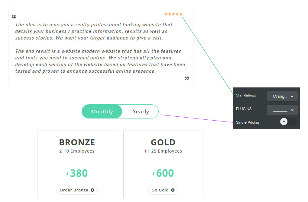
Plugin Options
Star Ratings:
3 colors for star ratings - orange (default), black and white.
You can also select "None" to remove the star ratings.
Single Pricing:
Removes the monthly and yearly pricing nav so that you
have only a single pricing option (not yearly or monthly).
3 colors for star ratings - orange (default), black and white.
You can also select "None" to remove the star ratings.
Single Pricing:
Removes the monthly and yearly pricing nav so that you
have only a single pricing option (not yearly or monthly).
Other Options
|
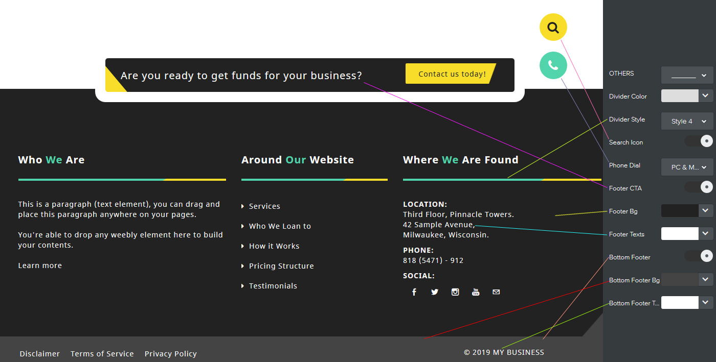
Divider Color & Divider Style:
Sets the color of the divider element while the divider style lets you choose from 3 different styles for the divider element. Footer Bg & Footer Texts: Sets the background color and the texts color of the footer. |
Search Icon:
Hide/show the search icon. Phone Dial: Let's you choose whether to display the phone dial icon on PC & Mobile, Mobile Only or None. Bottom Footer: Hide/show the bottom footer. |
Footer CTA:
Hide/show the call-to-action center (CTA) above the footer. Bottom Footer Bg & Texts: Sets the background color and the texts color of the bottom footer. |
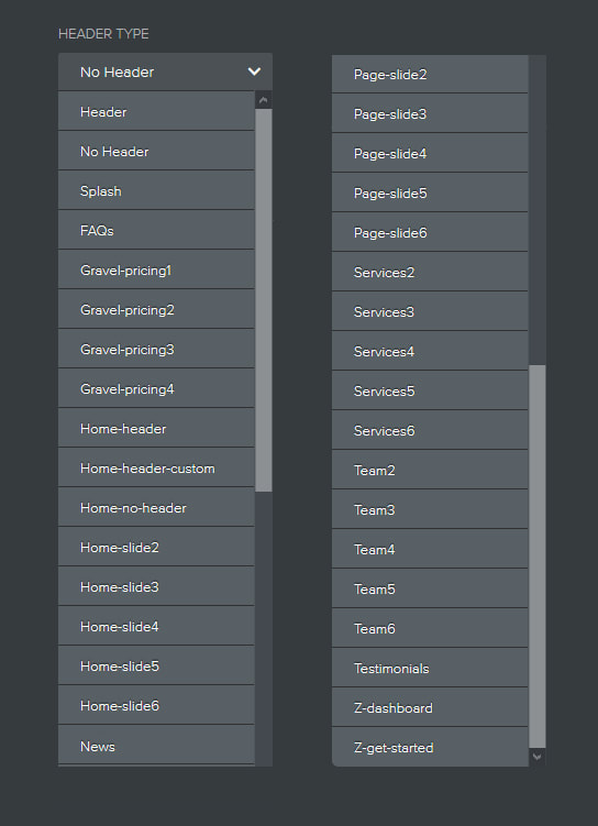
Header Types (Page Layouts)
Below are all the header types available for this theme.
You get to point your pages to these header types depending on your needs.
You get to point your pages to these header types depending on your needs.
|
Header & No Header:
Header layout has a background image across the top. No Header has no background image across the top. Both of these header types will help you build custom pages different from the ones we've pre-built for you, exactly the way you want. Gravel Pricing 1, 2, 3 and 4: Let's you have 1, 2, 3 and/or 4 pricing columns. Services 2, 3, 4, 5 or 5: Build services page like this one with ability to have 2, 3, 4, or 5 services. You can of course build your own custom services page. Team 2, 3, 4, 5 or 6: Build team page with 2, 3, 4, 5 and/or 6 team members. |
|
|